Have you noticed our new logo? See above! It has taken a long time to achieve the look and message we want to convey.
Since we changed our name to Caproni Collection in January of this year, we started discussing what we would like to see for a logo. We knew we wanted the name of our company to be the main focus and that we wanted an image or design to accompany it.
The Design Process
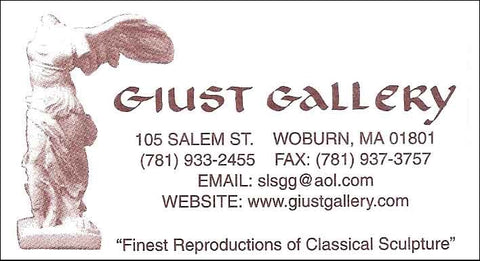
We had made our previous logo with text only (see below) for the Giust Gallery, but wanted to do a little more with the new logo.
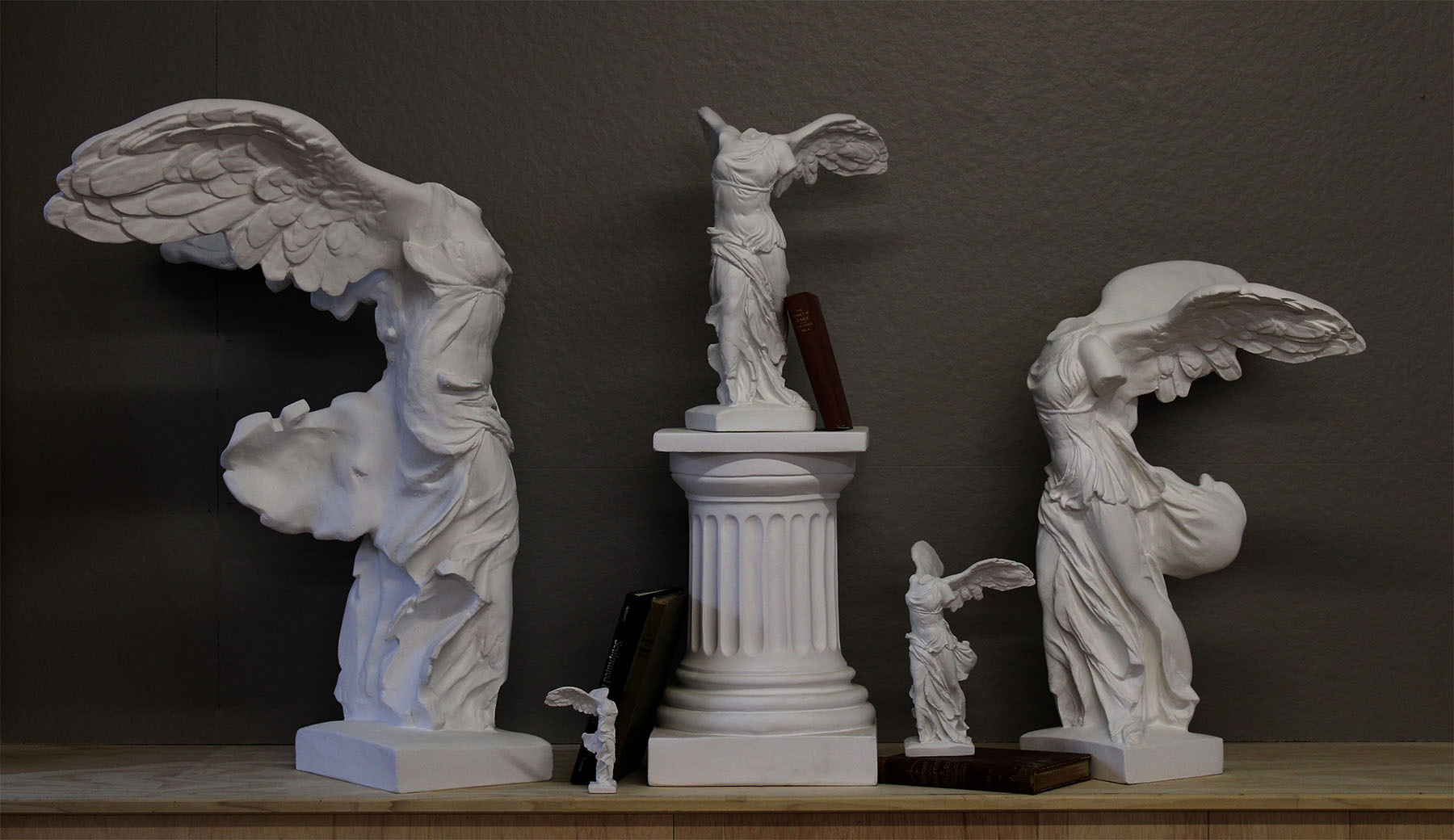
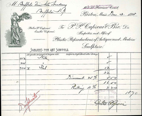
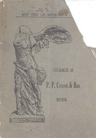
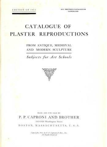
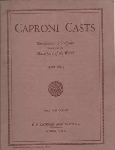
First, in graphic design software, we tried incorporating images of the Victory of Samothrace. The Victory had been used in the past by P.P. Caproni and Brother on catalogs and letterhead and later by the Giust Gallery on letterhead and business cards.
After several variations, we decided we would rather have a simpler look. We looked online at other logos and read suggestions for creating one.
Looking to the Past
After this research and discussions, we decided we wanted to base the logo in our own history. We searched the covers and copyright pages of all our antique P.P. Caproni and Brother catalogs to see what pieces or motifs they utilized over the course of 40 years of publications. Aside from the Victory, we found several ornaments that incorporated scrollwork, leaves, or flowers.
We took our favorites and placed them next to our name in a few different layouts. After review by the team, we ended up with our favorite.
The Final Design!
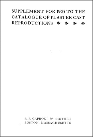
The leaf motif was pulled from the 1905 supplemental catalog which you can see above. We thought it had a classic feel and matched the weight of the text. It was also perfect to use on both sides of the text so we could keep the design symmetrical. Symmetry is important to us because it gives the design a sense of balance and harmony that reflects the beautiful art we reproduce.
We thought you’d enjoy learning about what went into the design of our logo, and to know that we created it right here in-house with our vision to reflect the history of the Collection but also to be relevant in the present and future.
Kind regards and best wishes for the holiday season,
Kathleen and Robert Shure
Want content like this delivered to your inbox? Sign up for our newsletter!